- 首页
- International
- 艾特奖
- 文化节
- 服务体系
-
网站导航
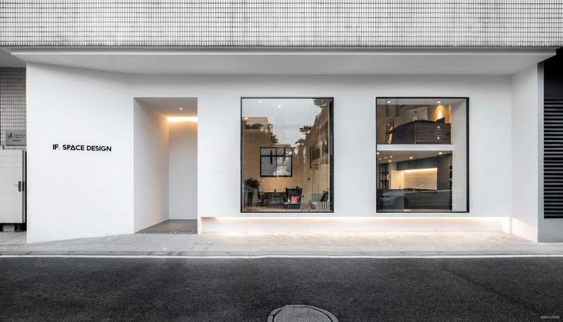
这个办公空间选址在一个创意园区,闹中取静,算得上是稍微带点艺术氛围的地理位置。这里在改造前是一个旧的办公楼,外立面贴着老式的瓷片,时间在这个建筑身上留下了一层老旧外皮。站在今天这个时间点,我想为它添加一些当代需求,更为建筑本身添上一层时代的肌肤。我运用了一种最为现代、简洁的形式,大面积白色灰泥涂料上墙,做了些原始感的肌理效果。大大的落地窗打开了房子的对外联络性,让光线自然进入室内的同时将室外的景也借了进来,同时也会给在外路过的行人一种展览的感觉。虽然简洁,却可以给人一种视觉冲击感。
在这次的办公空间设计中,大家应该可以一目了然发现到我运用的是混搭的设计手法。在这个空间当中,我将硬装弱化到最低,墙上和顶部也并没有运用任何造型,而是将重点放在了软装和配色上面。当然,所谓混搭,并不是毫无章法随意搭配,而是考虑到每个空间内的配色是否能做到和谐统一,是否能使处在这个空间中的人会有舒适的体验感。
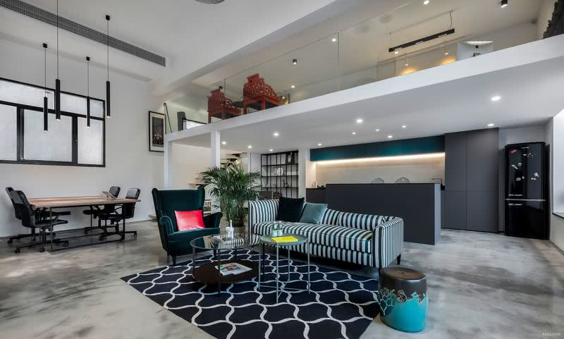
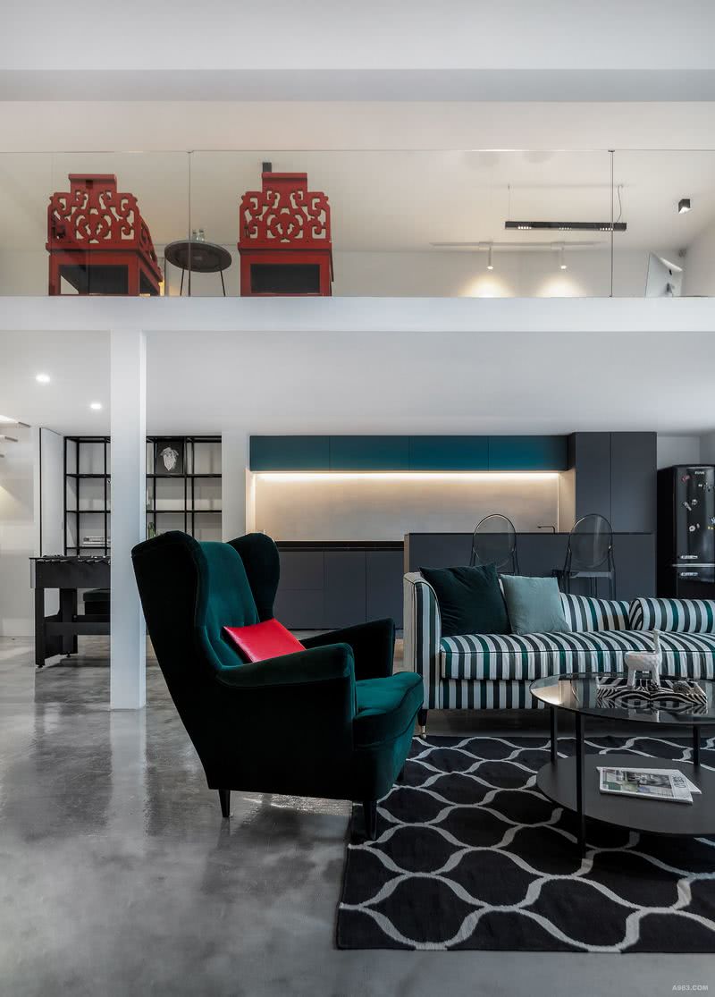
室内的整个空间是以白色为主基调,配合中性色黑、灰,运用绿色、红色去点缀。绿色是大自然给春天的颜色,更是能刺激到我灵感的颜色。所以在会客区,可以看到很多绿色元素,有单人沙发的墨绿,有条纹钢琴沙发的翡翠绿,有鼓凳的孔雀绿有抱枕的淡淡的绿,更有绿植的清新自然之绿,等等。当然,在绿色大面积出现时,我选择了它的对比色,用一抹红色加以点缀,我会觉得这是一种冲突的美更是一种和谐的自然的美。会议室的配色也很一目了然,运用了大面积黑色和红色,大胆却又和整个空间十分协调,不会独立出来。而红色壁纸的图案,也出现了中式元素,恰好同二楼的红色中式太师椅遥相呼应。这正是混搭中的和谐所在。我经常认为,在用色上稍微大胆些,就能让设计充满新意。其实空间质感是一种比较难以在大结构上体现的东西,所以软装是我觉得非常不可忽视的。在空间结构既定的前提下,让软装去覆盖与重塑。
当然了,一个好的设计作品,细节之处也更是经得起细细推敲与考量的,比如在这个办公空间中,两扇门的门把手就运用了两种截然不同却又都充满深意与新意的设计手法。比如大门处扶手,可以看出大小两扇玻璃门中间是由一个“釜”字型连接,这就要提到这家公司的名字“亿釜”,将它融入到大门的设计当中不仅起到一个名片的作用,更是加深了企业文化在表象上的体现。再比如会议室雾化玻璃上面的扶手,突破传统意义,将黑白根石材磨成最小厚度,倒角后直接贴到玻璃上面,方便手推又增加设计感的同时也与黑色门框形成完美的配合。
总之,我认为一个好的空间应该让人有一种强烈纯粹的体验感,会让人不自觉地去探索这个空间背后的艺术理念,去重新发现日常生活中被忽略的美学。
The studio is located in a creative park with some artistic atmosphere where you can find tranquility in a hustling surrounding. Before the transformation, it used to be an old office building, whose facade was covered with old-fashioned porcelain tiles,time has left an old skin on the building just like the traces left by time. Standing at this time point, I attempted to add some contemporary needs and put a layer of fashion to the building.I used a most modern and concise form, a large area of white plaster paint on the wall, to make some original texture effect. The big floor-to-ceiling windows open the external contact with the house, by letting the light enter the room naturally and bringing in the outdoor scenery, and also give an exhibition to the passing pedestrians outside.Regardless of the conciseness, it brings people a sense of visual impact.
In terms of the space design, it is obvious that the design method employed is mashup.In this space,I minimized the portion of hard decoration.There is no use of any shape on the walls or the ceiling.Instead, the emphasis is laid on the soft outfit design and color match.Without doubt, the so-called "mashup" is not a free and casual match,but whether the color in each space can be harmoniously unified, and whether the people in this space will have a comfortable experience.
The tone of the room is based on the color of white, along with the neutral colors of black and grey, and is decorated with the colors of green and red.Green is the color that nature gives to spring , and it also stimulates the color of my inspiration .Accordingly, in the lounge, you can see a lot of green elements:the dark green of the single sofa,the emerald green of the Striped piano sofa, Malachite green of the drum stool,and a light green with a pillow,the fresh green of green plants,and so on.Certainly, when a large area of green appears,I choose its contrast color---red to embellish,I regard it as a sort of harmonious conflict in beauty and nature.The color match in the conference room is very clear at the same time. The colors of black and red are largely used.It appears to be bold but is in harmony with the whole space.It will not be isolated.Furthermore the red wallpaper also has a pattern of Chinese elements.,exactly the red Old-fashioned wooden armchair upstairs echoed with each other.This is the harmony of the mix.I always ponder that the boldness in the use of colors can make the design more innovative. In fact, space texture is a kind of thing that is difficult to embody in large-scale structure,so soft outfit is very important for me.Under the premise of the established space structure,the tasks of covering and reshaping are left to the soft outfit.
Certainly,for a good design works, details should be more worthy of scrutiny and consideration.For example, in this office space, two distinctive and meaningful design techniques are used in the handles of two doors.For example, the handrail of the entrance gate is exactly like the Chinese character”釜”, which originates from studio’s Chinese name “亿釜” ,it is not only shown as a business card to everyone,but also deepen the embodiment of the enterprise culture in the appearance.For example, the armrest on the atomizing glass of the conference room breaks through the traditional meaning,by grinding the black and white stone into the minimum thickness and sticking it to the glass directly after the chamfering. It is convenient for hand push and adds the design sense to increase the perfect match with the black door frame.
In a word, I consider that a decent space design could provide people a strong sense of pure experience, let them explore the artistic ideas behind this space automatically and help them to rediscover the neglected aesthetics in everyday life.

外立面门头

会客区(一)

会客区(二)